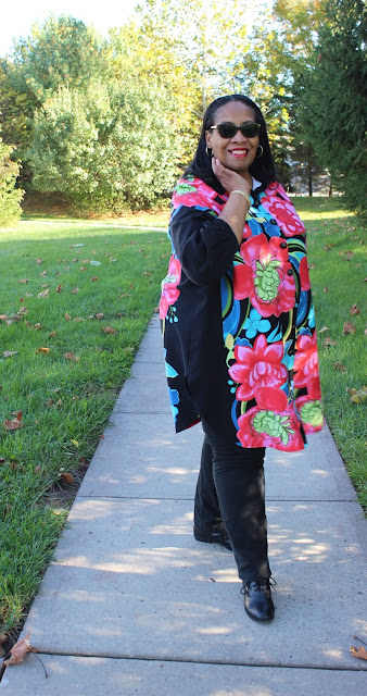
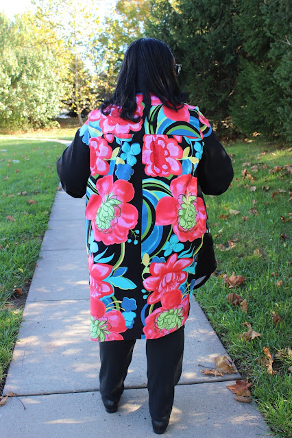
This shirt has been finished for weeks. It's taken time to get another appointment with my daughter to photograph it. Technically it should have been photographed with the last bunch of summer dresses but that day was so dayum hot, I just couldn't handle wearing it for pictures.
Y'all know I love panel prints, border prints, directional prints, any fabric really that makes me think outside the box when using it. So of course in August during the Fabric Mart shopping spree, border and panel prints were on the top of my purchase list. I've recently acquired quite a few border/panel prints from Fabric Mart and many have made it to the blog ~ here, here, here and here. Also, if you're new to the blog, I've written several blog posts about working with border prints, just follow the highlighted link.
For this panel print, it was the bold floral that called my name. It was such a strong calling that I sewed this up weeks after I got home.
Supplies ~
Pattern: Vogue 9299
Fabric: 6 cotton sateen panels from Fabric Mart's brick 'n mortar store
Buttons: 12 black domed 5/8" buttons from MJ Trimmings
Interfacing from Steinlauf & Stoeller
There are no new construction techniques in this make. For this tunic it's all about the fabric placement.
So I'm sharing some of my construction/pattern placement pictures...
A Few Photos ~
I've worn this tunic to work and received a couple of compliments on it. The tunic makes a dramatic statement that's tempered by the solid black sides which add a slimming effect to it. This is the reason I love border prints and panels so much!
It's not the last time I will use this pattern this fall/winter because it works perfectly for my lifestyle. I have more ideas using prints & stripe placements to make it sing! Plus can you really have too many comfortable tunics that layer well during the chillier weather?
...as always more later!


Wow Carolyn! A fabulous print! It looks amazing on you :-)
ReplyDeleteNicely done! I particularly like the flower capping the sleeves.
ReplyDeleteHi Carolyn, I try to read all of your blogs for entertainment and inspiration. When I saw your thumbnail on Bloglovin', I said "dayum" and smiled. When you used it in your intro, I got a chuckle! Thanks for being "you"! As I perused your panel tunic pictures and process, I enjoyed your thoughtful use of this fabric. The tunic is beautiful, it IS slenderizing and you can pull off a vibrant print like this! Keep on keepin' on!
ReplyDeleteOH goodness! What a great idea for the sleeve cap. I will most definitely borrow that idea, OK? The shirt is very dramatic and goes far beyond oh did you make that. Project R. Avant garde good. Thanks for keeping us inspired.
ReplyDeleteGorgeousness!
ReplyDeleteI love it! It looks so fantastic, and the mix of bright colors with the black is just perfection.
ReplyDeleteYour tunic projects your personality--WIN WIN!--Anne
ReplyDeleteI love it when you use a border print! Those sleeve caps though, they are a beautiful, well-thought-out, & clever detail
ReplyDeleteYou have an awesome, inspiring, eye for details. Truly love the materials you chose for this and your previous post. I pre-ordered Cashmerette book; looking forward to learning. Be safe. Stay well.
ReplyDeleteOh, so pretty on a dark winter's day. I love the colors. And especially appreciate how you make clothing that fits you rather than fit yourself into the clothing. Inspirational!
ReplyDeleteThank you for the tutorial. Absolutely genius pattern placement on the sleeve cap. It adds so much to an already elevated tunic. The black sliver down the front allow the pattern to stand out even more. You are an inspiration.
ReplyDeleteYou look so beautiful in your shirt. Love the inspiration of how you used the print.
ReplyDeleteThis is truly stunning, and suits you so well. You look beautiful in this tunic. The cap sleeve placement is just genius! (applause!).
ReplyDeleteWow! I really like this one on you.
ReplyDeleteGreat placement! Panel prints are such fun and you do them justice. Thanks for the inspiration.
ReplyDelete